Progress indicator
A progress indicator shows where a user is in a linear, multistep process. The interactive variant also allows users to return to previously completed steps.
Live demo
This live demo contains only a preview of functionality and styles available for this component. View the full demo on Storybook for additional information such as its version, controls, and API documentation.
Accessibility testing statusFor every latest release, Carbon runs tests on all components to meet the accessibility requirements. These different statuses report the work that Carbon has done in the back end. These tests appear only when the components are stable.
For every latest release, Carbon runs tests on all components to meet the accessibility requirements. These different statuses report the work that Carbon has done in the back end. These tests appear only when the components are stable.
Overview
Progress indicators help manage a user’s expectations when completing a multistep process. They show which step the user is currently on, the total number of steps, and overall progress in completing a task.

When to use
- When the user is working through a linear process that can be organized into three or more steps.
- When the user could benefit from understanding their progress on long forms such as eCommerce checkouts, onboarding, or visa applications.
- When user inputs should be validated before progressing to the next step.
- To complement standard back/next navigation in a linear sequence.
When not to use
- When a process or form has fewer than three steps.
- When the process may be completed in any order.
- When the number of steps may change based on conditional logic.
Variants
| Variant | Purpose |
|---|---|
| Default | Allows users to see where they are in a linear, multistep process. |
| Interactive | Allows users to return to a previously completed step. |
Formatting
Anatomy

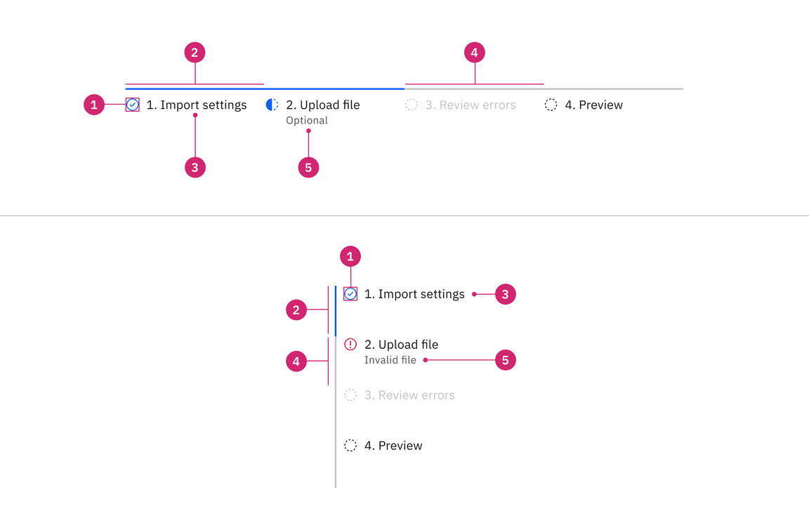
- Icon: Communicates what needs to be selected below.
- Active step line: Indicates these states–current and completed
- Label: A checkbox input indicating the appropriate state. By default it is unselected.
- Inactive step line: Indicates these states–incomplete, error, disabled, and skeleton
- Optional label or error label: Describes the information you want to select or unselect.
Alignment
Progress indicators can be in vertical or horizontal position depending on the use case and the structure of the UI. When possible, arrange the progress indicator vertically for easier reading.
Placement
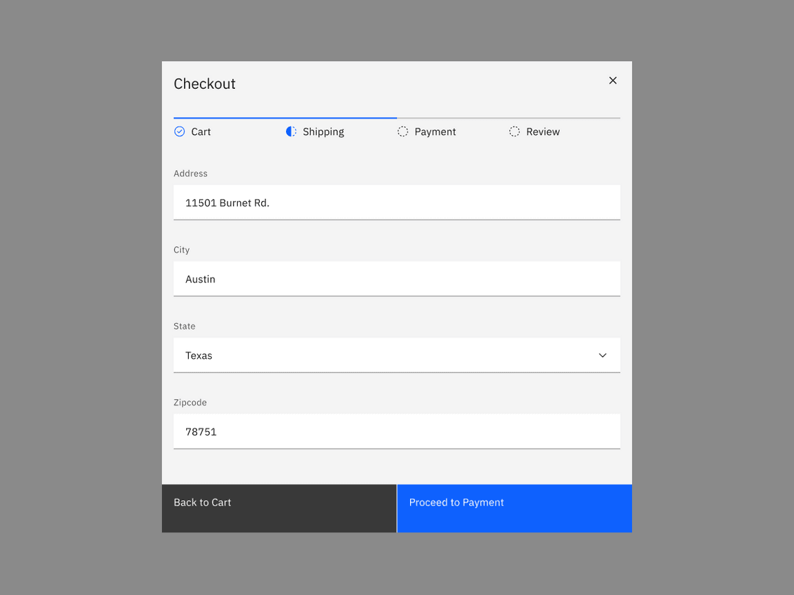
The progress indicator component is often used in forms. Forms can be placed on a full page, in a modal, or in a side panel.
IMAGE TK: Get high res image. Likely needs design work first.

Checkboxes in a form should be placed at least 32px (layout-03) below or before the next component. Spacing of 24px (layout-02) or 16px (layout-01) can also be used when space is more restricted or if the form is more complex.
For more information on spacing in forms, see our form style guidance.
Content
Main elements
Indicate the current step
- Keeping the user informed of where they currently are within the process or task at hand will give them a sense of control. This helps the user to know where they are in relation to where they have been, and what sections are to follow.
- When it comes to labels or optional labels in progress indicator, it is best to keep them short, descriptive, and meaningful. Avoid using complex words or sentences and use one or two words instead.
Label
Labels indicate steps which users need to complete to accomplish a task. Avoid vague terms like “Loading” and “Processing”.
Optional label
Optional labels indicate a step as optional or additional context about a step. Optional label is required when there step is invalid or in the error state.
Overflow content
When there is not enough space, consider rewording the label or truncate the label text with an ellipsis and provide a tooltip to convey additional information.
Long optional labels may wrap to a second line, and this is preferable to truncation.
Optional label should wrap beneath the label so both types of label are always left aligned.
IMAGE TK: find high res version of Figma prototype
Further guidance
For further content guidance, see Carbon’s content guidelines.
Behaviors
Logical progression
Display the steps in order from left to right. Indicate to the user that they are performing a multistep process, and show the direction of movement. Allow the user to return to a previous step to review their data submission.
Indicate the current step
Keeping the user informed of where they currently are within the process or task at hand will give them a sense of control. This helps the user to know where they are in relation to where they have been, and what sections are to follow. Clear labels should accompany the progress indicator to indicate what the user will accomplish within each step. Keep labels between one to two words.
States
Progress indicator has five main progress states: incomplete, current, completed, error, and disabled and two main interactive states: focus and hover. View the Style tab for more visual presentation of each state
| Variant | Purpose |
|---|---|
| Incomplete | When users have not interacted with the information within a step |
| Current | When users are interacting with the info within the current step |
| Completed | When users complete filling out the information within a step |
| Error | When users have interacted with the information within the step but have not completed the step. There could also be an error or failure has occurred during the process. It should provide clear information about the error and guidance on how to resolve the issue |
| Disabled | When the user cannot interact with a component and all interactive functions have been removed. Unlike read-only states, disabled states are not focusable, are not read by screen readers, and do not need to pass visual contrast, making them inaccessible if they need to be interpreted. |
| Hover | When a user’s mouse cursor is hovering over the progress indicator’s step |
| Focus | When a user tabs to or clicks on the progress indicator’s step, the step becomes focused, indicating the user has successfully navigated to the component. |
Interactions
Mouse
Users can trigger a state change by clicking anywhere in the step progress area.
Keyboard
One tab should be selected by default. Users can navigate between tabs by pressing right or left arrow keys.. For additional keyboard interactions, see the Accessibility tab.
Screen readers
VoiceOver: Users can navigate between tabs by pressing right or left arrow keys.
JAWS: Users can navigate between tabs by pressing right or left arrow keys.
NVDA: Users can navigate between tabs by pressing right or left arrow keys.
For additional information, see screen reader tests.
Validation
Use validation to confirm that a previous step has been completed. If the user cannot proceed onto another step without first completing a task, use an Inline Notification to inform them.
Responsive behavior
Display the steps in order from left to right or top to bottom. Indicate to the user that they are performing a multistep process, and show the direction of movement. Allow the user to return to a previous step to review their data submission.
Default selection
Clickable areas
Loading
Component type name
Modifiers
Related
References
Feedback
Help us improve this component by providing feedback, asking questions, and leaving any other comments on GitHub.